gap golf

agency
role
brand design, website design, user experience design
building a brighter, more modern a digital brand system
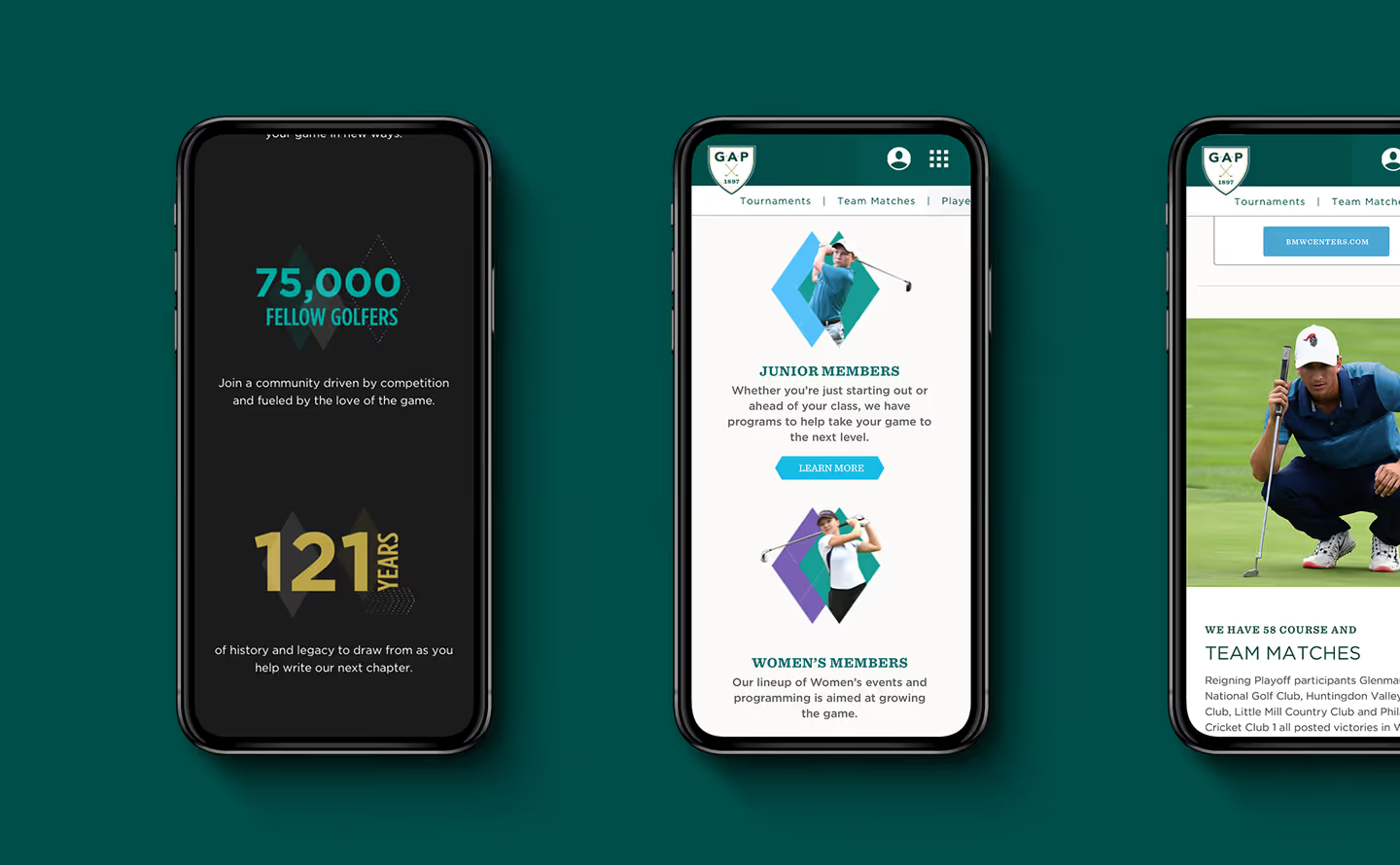
the golf association of philadelphia came to defy to build out their digital identity. armed with only a logo and a bare bones style guide, it was a large task to modernize it. golf as a sport has a cultural association with wealthy white men, but gap’s mission is to provide opportunities for more people across the region to enjoy the game. as such, an important part of the rebrand was ensuring to highlight and appeal to a more diverse range of offerings, especially women and youth.


graphically, the new brand included new brighter colors to accent the more stayed green and gold. the angled diamond shapes and patterns that are layered throughout the graphics and website are reminiscent of both modern golf fashion, and the patterns mowed onto golf courses.


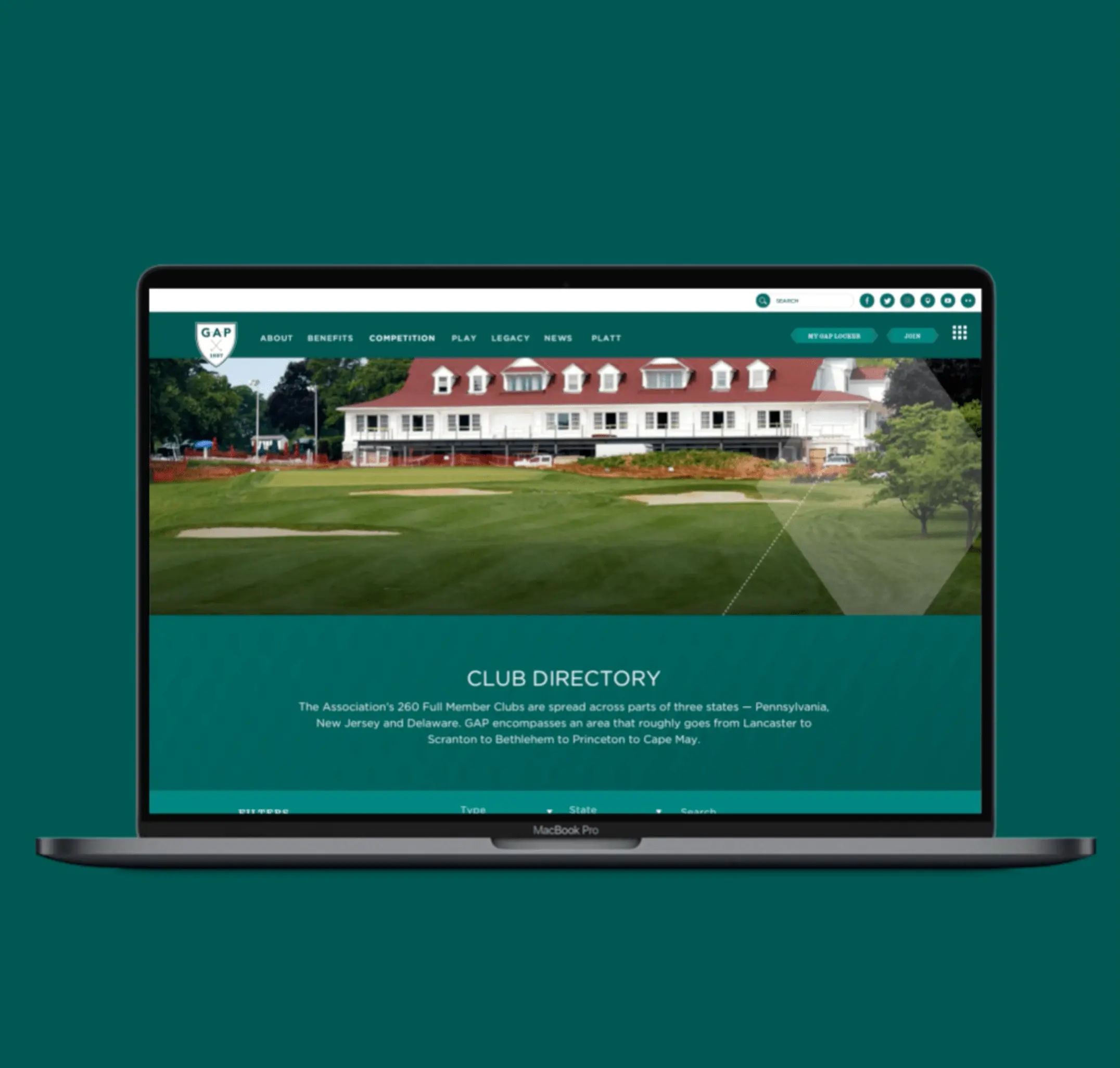
the largest part of the project was designing the competition section of the site to display large amounts of data — taking up-to-date information for tournaments, years of historical data for player scouting, course information and displaying it all in a way that made it more accessible to users. most of this was buried in tables that made it more difficult to access, especially on mobile. we redesigned these areas, both reorganizing the section to make a more straightforward flow of information from page to page, as well as giving it a face lift to match the new design language and be easier to navigate on mobile.


the final piece was designing the gap app. the app shared many similarities with the competition section of the website, sharing many of the same challenges, and pulling from the same design language. designing for the app required a deeper dive into the user experience and more granular wireframing since the focus was to give users on-the-go access to tournament information.


